Advanced Thematic Mapping

Short on time? Just read the bolded text.
Project Overview
In this project, I designed a feature to help Sales Leaders  visualize data on a map so they can compare geographical areas or territories. This case study highlights one specific challenge I encountered during the design process — but it's just a small part of a much larger project where I designed the full feature.
My Contributions
I held research calls with power users, created user journeys, designed the UX in Figma, and finally coordinated the handoff.
When I chose to conduct exploratory research, I uncovered a key insight: Sales Leaders struggled with creating their legend settings, ultimately blocking them from realizing the value of this feature quickly and dropping off.

Creating a legend requires users to make dozens of decisions — from data classification and calculation methods to record types and custom filters. But our users are Sales Leaders, not data scientists. They don’t want to dive into the technical details — they just want to understand what next step they should take based on the data.

How do I help Sales Leaders quickly realize the value of seeing the data on a map — without overwhelming them in the creation process?
Defining the Problem
Exploratory Research
2 weeks
I began by mapping out every decision a user might make to create a legend. From here, I made a key decision:
only ask users what’s absolutely necessary.


Anywhere I could, I made assumptions based on defaults or previous inputs so users could be set up faster with less friction.

After I ironed out the structure, I then made another big decision: implement a progressive flow.

Why a progressive flow? Because they have higher completion rates—especially when users are making unfamiliar decisions. With a progressive flow, we can easily push users through a series of complex questions by given them a sense of completion and progress.
Crafting the Solution
Iteration & Direction
3 weeks
Interview questions asked during research
User flow for data collection
Example of ORCA Modeling (Objects, Relationships, Calls-to-action (CTAs), and Attributes) for geographic areas
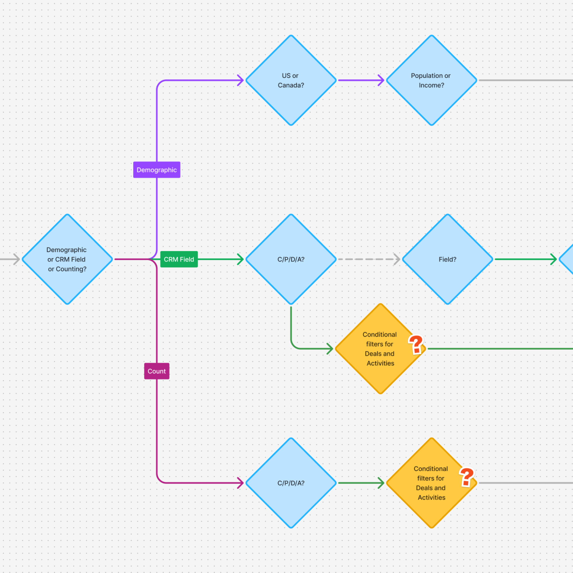
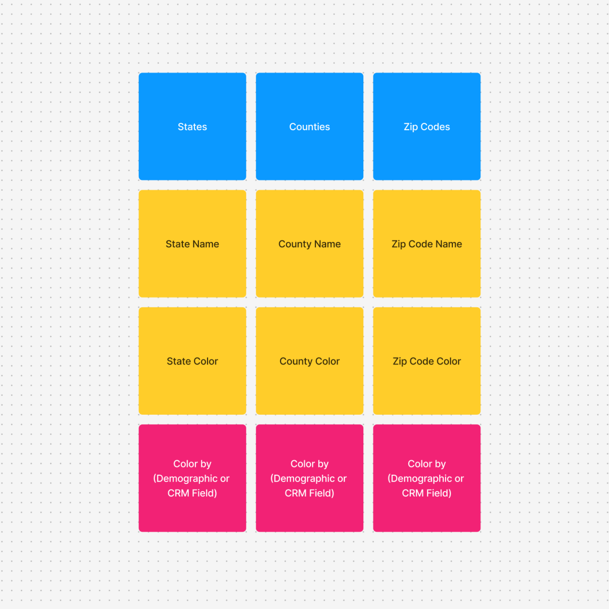
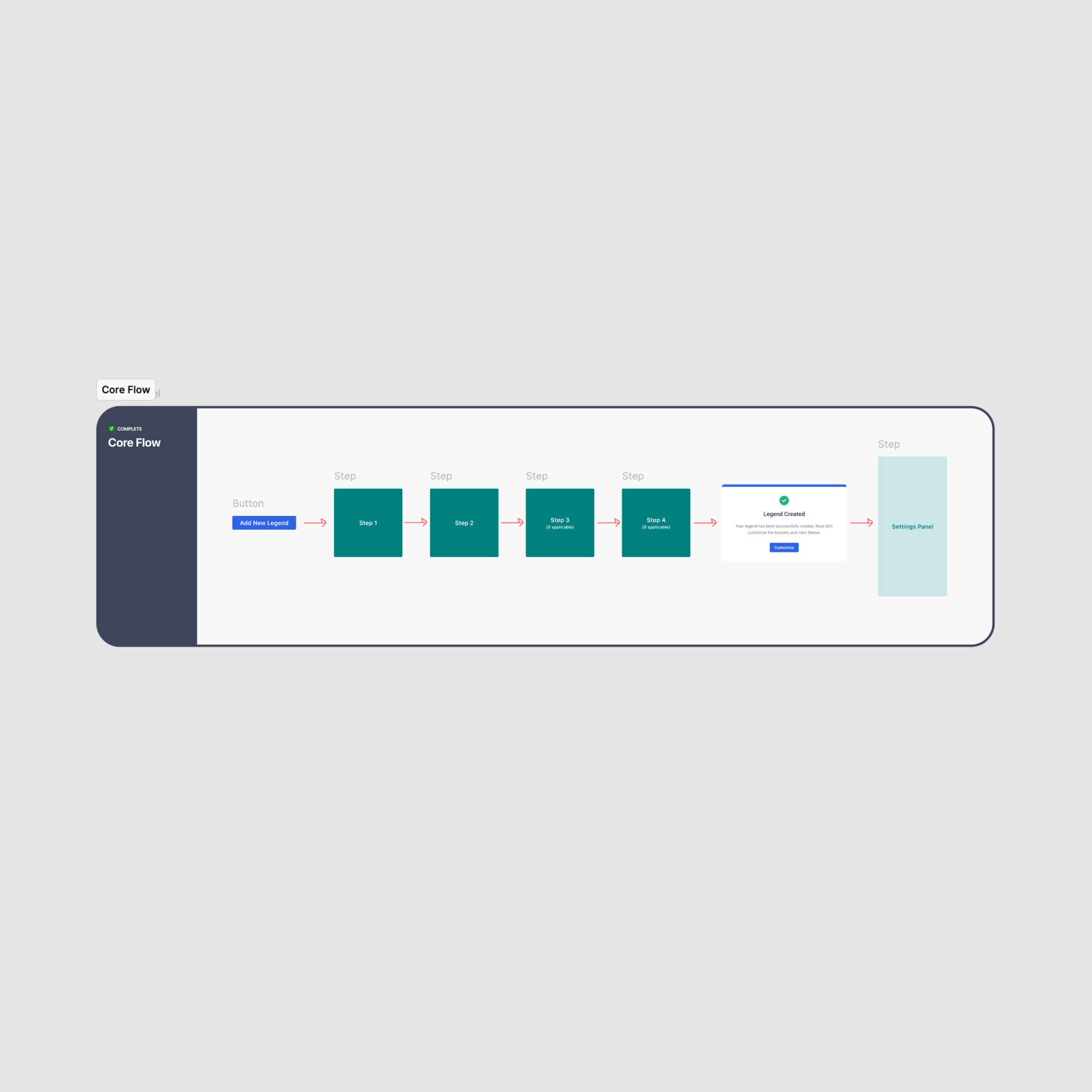
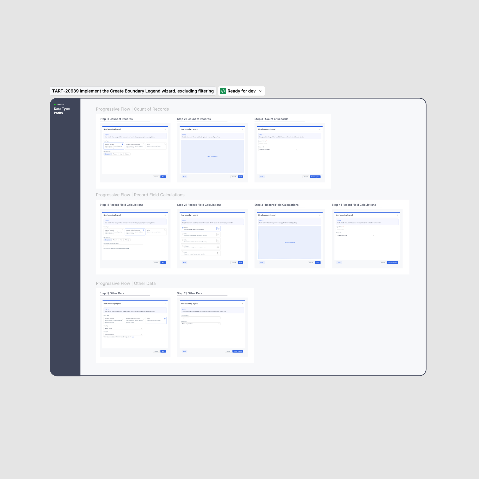
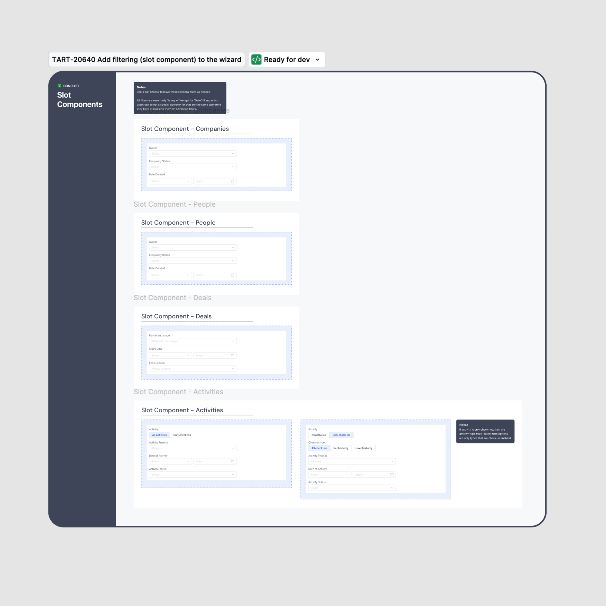
For handoff, I separated the progressive flow into 3 sections: the flow at a glance, breakdown based on the dataset, and an even deeper level for record type custom filters.

By utilizing slot components and a predictable grid pattern in my handoff, I was able to significantly reduce confusion that usually ensues with our remote team.

There were only 2 follow-up questions asked after handoff, which is pretty rare for our team. The method I used for handoff saved us an estimated 32 hours of meetings and Slack conversations that usually come with a project of this scale and complexity.
Handoff
Iterations & Direction
3 weeks
High level progressive flow at a glance
Detailed version of progressive flow, broken down by the data type - count of records, record field calculation, and other datasets.
Slot components for record type custom filters
The result of these key decisions and the seamless handoff is a feature that feels lightweight and intuitive, even while handling complex logic behind the scenes. I learned that using a three-step structure — high-level overview, breakdown, and details — helps maintain clarity during handoff.

With Advanced Thematic Mapping, users now have a powerful data analysis tool at their fingertips and can build insightful maps without relying on a data team.
Success & Learnings
Delivery