A major design decision I faced was whether to extend the current mobile UI—or replace it.
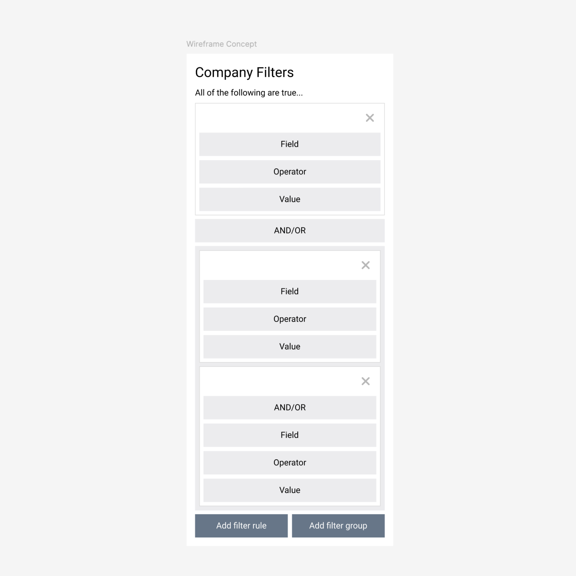
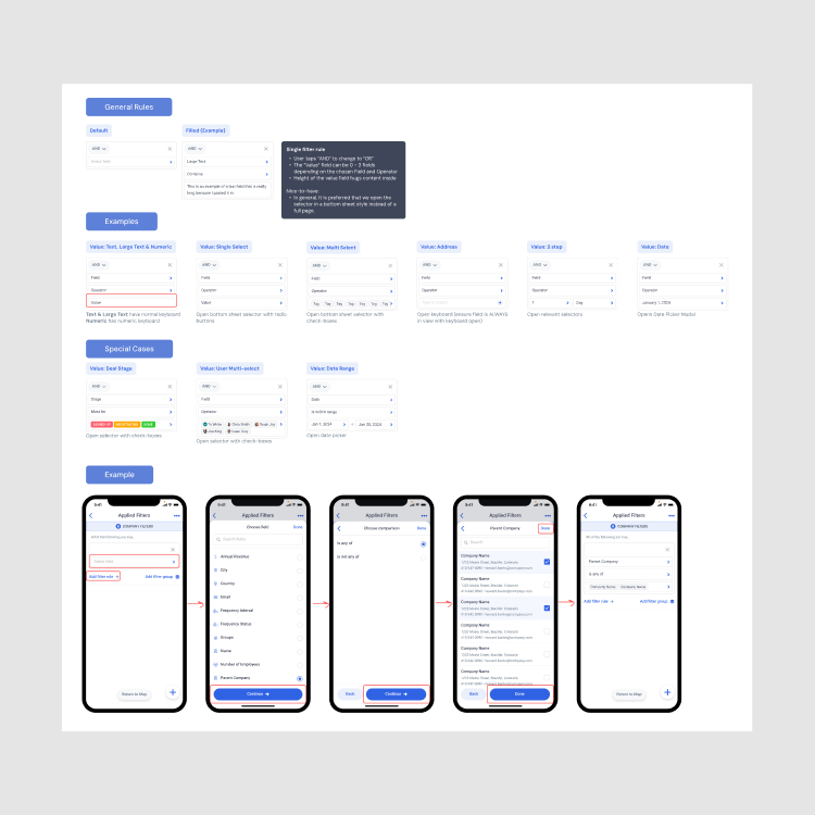
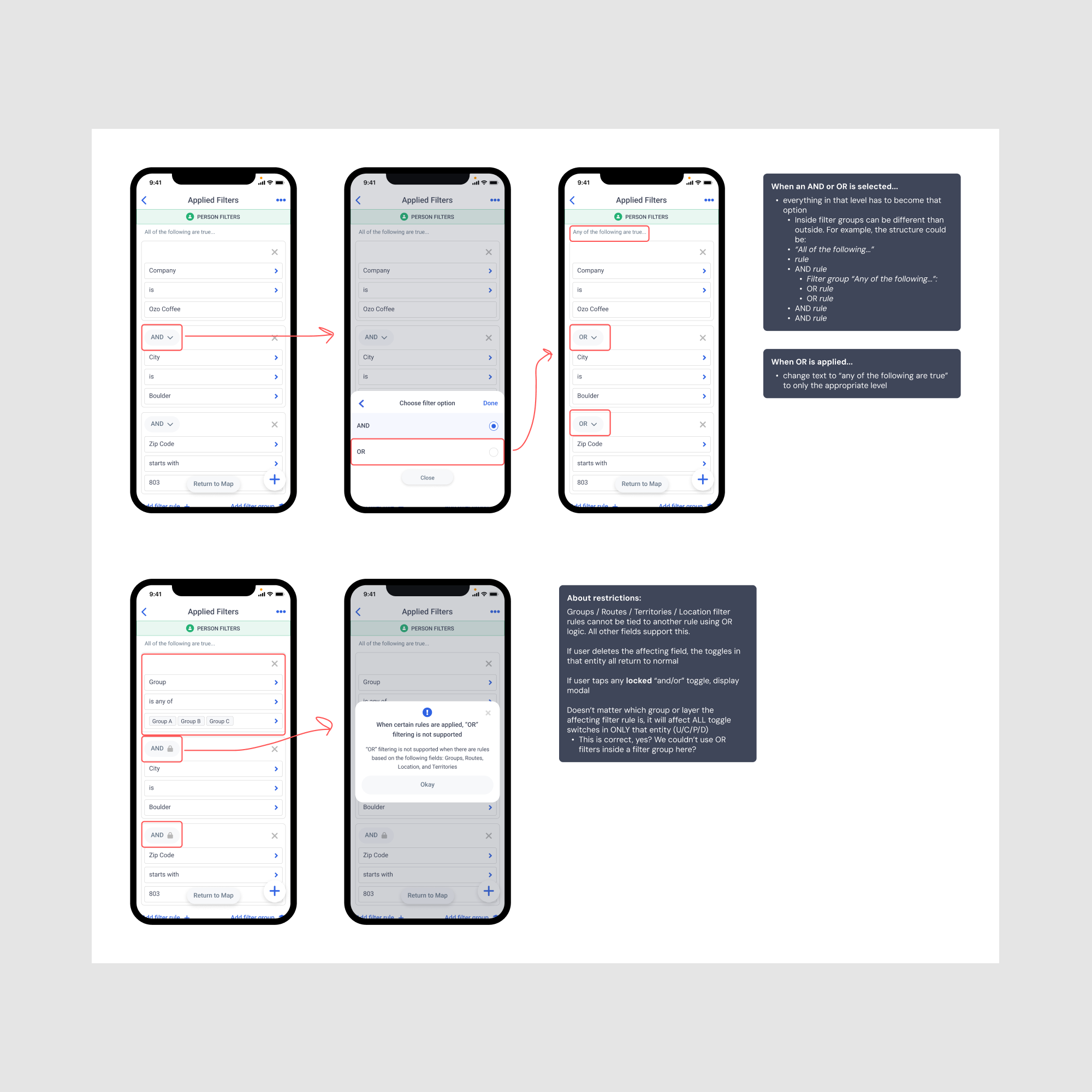
I explored fitting AND/OR logic and grouped rules into the existing flow, trying to keep familiarity and minimize change-related friction. But after testing several iterations, it became clear the old UI couldn’t scale cleanly or be truly usable.
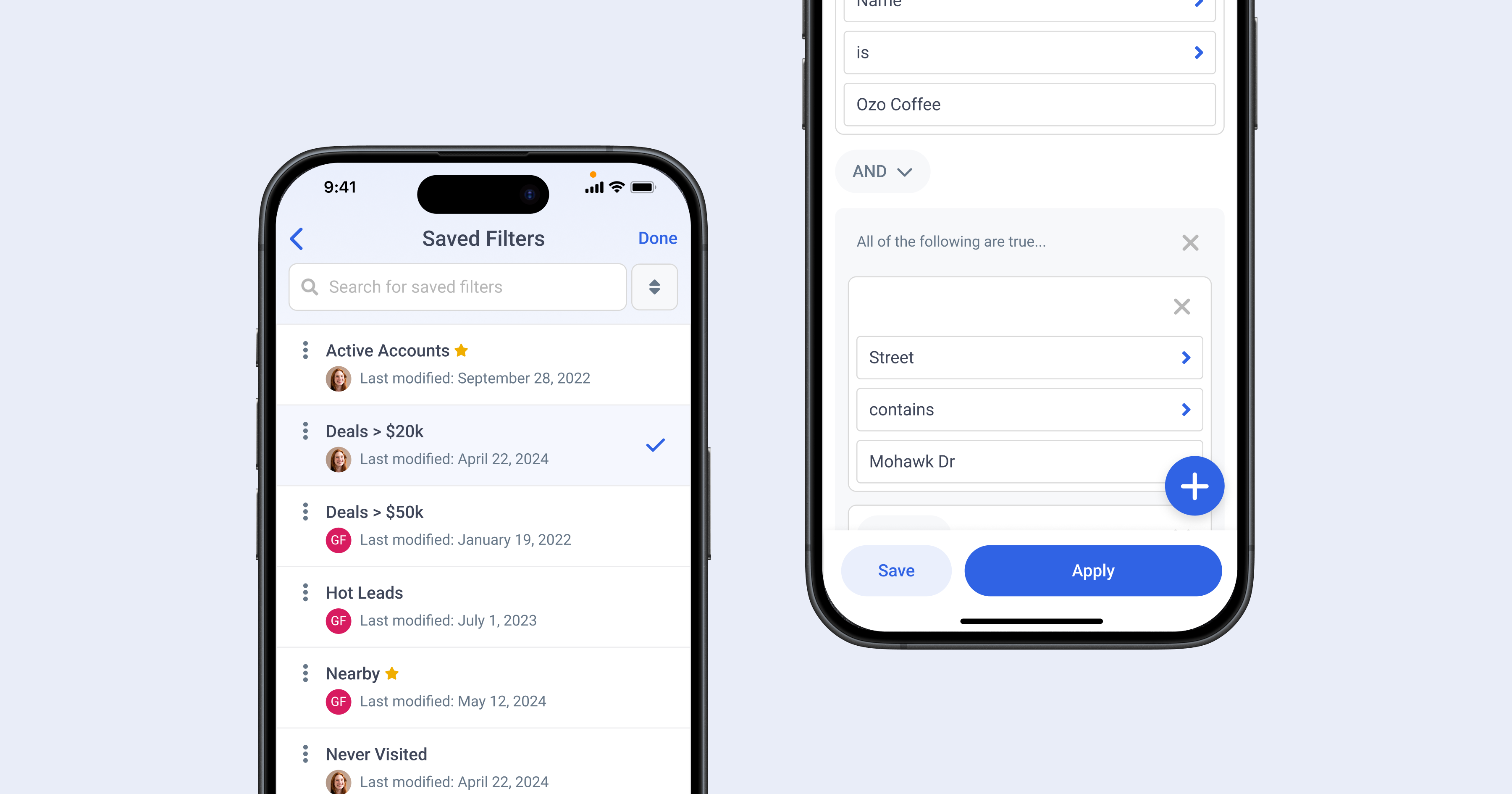
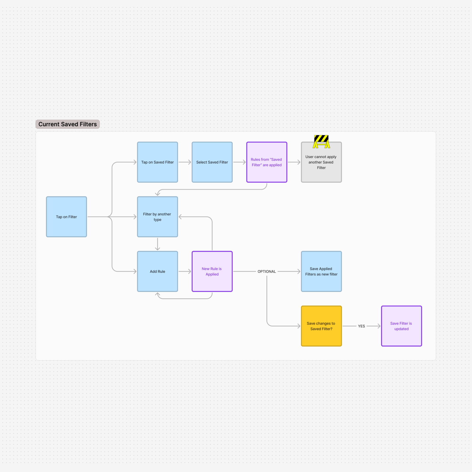
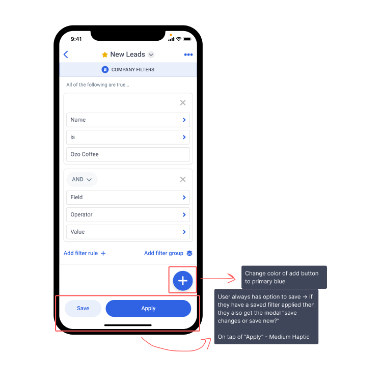
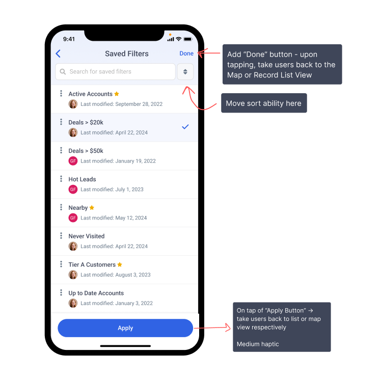
So I redesigned the mobile interface. The new version added inline rule editing, visually grouped logic blocks, and consistent action placement—making it easier for users to see and update their filters confidently.
In usability tests, new users picked it up quickly, and experienced users said the added flexibility was worth the learning curve. Once familiar, they appreciated how much faster it was to build what they needed—a key pain point from earlier research.
On web, I preserved stability by routing users to the advanced filters modal when inline logic might break. This avoided confusion and kept edge cases from derailing the experience.
Crafting the Solution
Iteration & Direction